Wednesday, 11 March 2015
Tuesday, 10 March 2015
Wednesday, 4 March 2015
Drafting and Planning - main photo
The main photo symbolises the upset and hurt that is expressed in the song and the video. It shows a girl looking like she has got ready and gone out for the night and things have taken a turn for the worst and she's beginning to look a state from the effects of alcohol, drugs and emotional pain.
I edited the picture so that it was mirrored as I felt it would look better the other way round on the advertisement and CD cover so that the details are given before the image.
I then decided to make the image black and white to match the theme of the video and the colour scheme of the second half. It also went well in this colour with the smoke background images for the CD and advertisement. However, it looked dull and did not stand out well so I chose to highlight the colour red to attract attention and to also symbolise danger and love which fits in with the message.
Overall, I think the image looked effective and fits in with the message of the song and video and also the colour scheme and style.
Wednesday, 25 February 2015
Tuesday, 24 February 2015
Drafting/Planning - Work In Progress - Opening Scene
This is the opening scene in my music video.
It fits in with the lyrics as the first words are 'I want you to breathe all of this in' and then the smoke reverses to look like he is breathing it all back in.
It also fits with the beat of the song as the smoke reverses just as the beat drops for the first time with 'I wanna stay high all the time'. I have also slowed down the process of the smoke being blown out so that it lasts the length of the first words and then I have sped up where the smoke is reversed so that it hits the beat.
I like the reverse effect as not only does it help the video fit with the song, It also makes the scene more interesting and it is effective in this scene as it emphasises the initial drop of the song and starts the video off on a high.
Thursday, 12 February 2015
Drafting/Planning - Effects I have used
So far while editing my video, I have used many effects to make my video interesting and appealing.
An effect I have used in my video is making the smoke at the very beginning reverse back after being blown out. This suits the very first lyrics 'I want you to breathe all of this in'. This scene has also been slowed down at the beginning where the smoke has been blown out and sped up when it has been reversed.
I have also used the reverse effect further on in the video, where a drunken girl is walking down the stairs. In this scene, she stumbles down the stairs, with make up down her face and holding her shoes and then the scene reverses and changes into black and white. I added this effect as the black and white highlights how the girl feels and it looks interesting and effective.
I have used the reverse effect again in the video, on a smoke trick. The person performs the smoke trick and then it reverses so it looks like they are breathing it all back in again. I like this scene as it looks really fascinating and highlights the smoke trick.
I have also slowed down scenes and sped them up. I slowed down a scene where a girl has had too much to drink and is walking out of a door. This makes the scene slow motion and expresses how a drunk person feels.
I have slowed down and sped up different smoke tricks throughout the video, to make them stand out and look good.
As well as this, I have added a green wash over scenes that are not already green as this makes them fit in with the party scenes and helps with the continuity of the video.
Tuesday, 10 February 2015
Drafting/Planning - issues with my video
While editing my footage, I have realised that there is not enough to cover the whole track. This may affect the continuity of the video as scenes will have to be filmed again or added in and they may not look like the ones I already have. So far I have around 2 minutes of my video filmed, extra will have to be added in to make it up to a 3 minute 14 second video.
There is a green wash to my video as the scenes were filmed in a party room with green lights and flashing lights, this means the wash has to be added in to the scenes that have not been filmed in this room. This has been difficult to achieve but I have managed to do so. However, if the colour is not exact, this will again affect the continuity of the video and make it look less professional.
Also, even though the camera was a professional camera, some parts are not perfectly clear, making the video look less professional. These shots will have to be re-filmed to make the video look as good as I want it to be.
Thursday, 5 February 2015
Drafting and planning - ideas for album cover/logo
This is an idea for the 'Keys n Krates' logo and album cover. There are two 'K's to represent the name and this can be the logo for the band like the 'Take That' logo.
This would be a memorable logo for the band as it is in the shape of a star and it is a unique style. This can be made transparent over the image or be made smaller to be used as a logo.
Friday, 23 January 2015
Drafting and Planning - Serif Movie Plus XS
I have filmed short clips for my music video and need to edit them and put them all together to fit the song and style.
To edit my music video I am using a programme called MoviePlus which allows me to crop, trim, slow down and speed up clips as well as adding effects such as filters. I can also fade in and out so my video is smooth and looks professional.

To edit my music video I am using a programme called MoviePlus which allows me to crop, trim, slow down and speed up clips as well as adding effects such as filters. I can also fade in and out so my video is smooth and looks professional.
Wednesday, 21 January 2015
Drafting and Planning - Mood board
Just before I film and put together my music video, digipak and magazine advertisement, I thought it would help me to do a quick mood board of lots of things I want included and give me my final ideas and plans. I think this is effective as it inspires me to create my video in the way I want it and makes me feel more at ease knowing what I need to get done.
Monday, 19 January 2015
Organisation of props - props I have collected
Over the months I have asked family and friends if I can keep their empty alcohol cans and bottles to use as the props for the music video. There are party scenes where there will be a lot of alcohol needed in the background and to make it look realistic.
Wednesday, 14 January 2015
Wednesday, 7 January 2015
Drafting and planning - mock album cover
This is a draft of one of my ideas for a CD cover. I had the idea of using the smoke as the background as smoke will be featured in the video. I also kept the colours dull to portray the mood of the story behind the video. I have used a young, pretty model which is what people would expect to see in a trap music video. I like the font I have used as it is clear and looks different to what is usually seen.
I may re-do the same type of cover in a more colourful style, including red as there will be a red wash over some scenes in the video so this will keep continuity.
Tuesday, 6 January 2015
Drafting and planning - fonts
These are the fonts I am currently looking at to use for my album cover. I have used the single name 'stay high' to test out the fonts and see what they will look like.
Friday, 2 January 2015
Research into similar products - Inspiration for the cover image
Like tove-lo, I want the front cover of my album to include one of the girls from my video upset and showing the tone of video and the story behind it. This will be an image like:
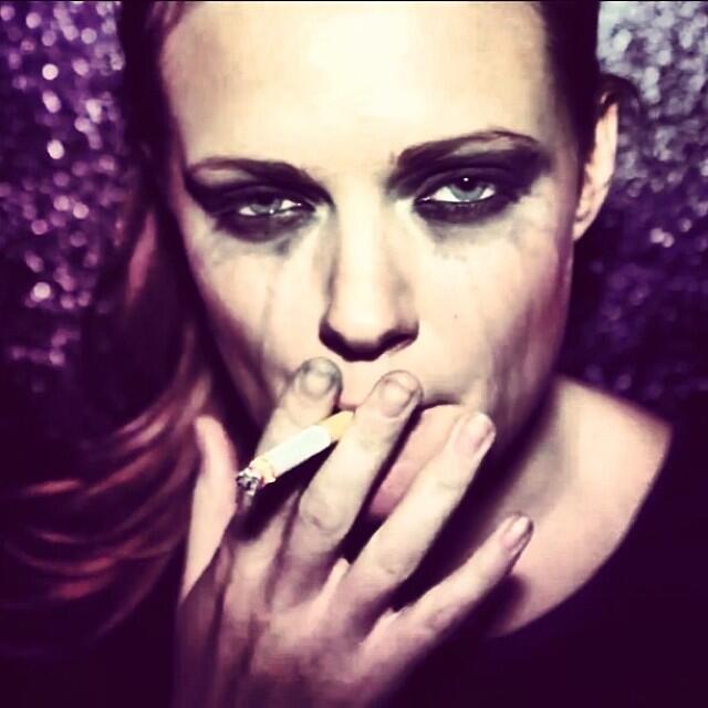
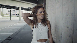


I feel that this would be effective as it would continue the dark vibes of the album and video and link them both together. It would work as continuity and give the audience a sense of what the song is about and how the video goes.
Or I am thinking of taking a screenshot of part of the music video, a bit that looks casual and not as
dark such as:

These would be effective as it doesn't give away anything about the video or song and may make the audience want to view it. It would be mysterious and make the audience wonder what the link between the video and the song is.
Subscribe to:
Posts (Atom)


.jpg)
.jpg)


